About
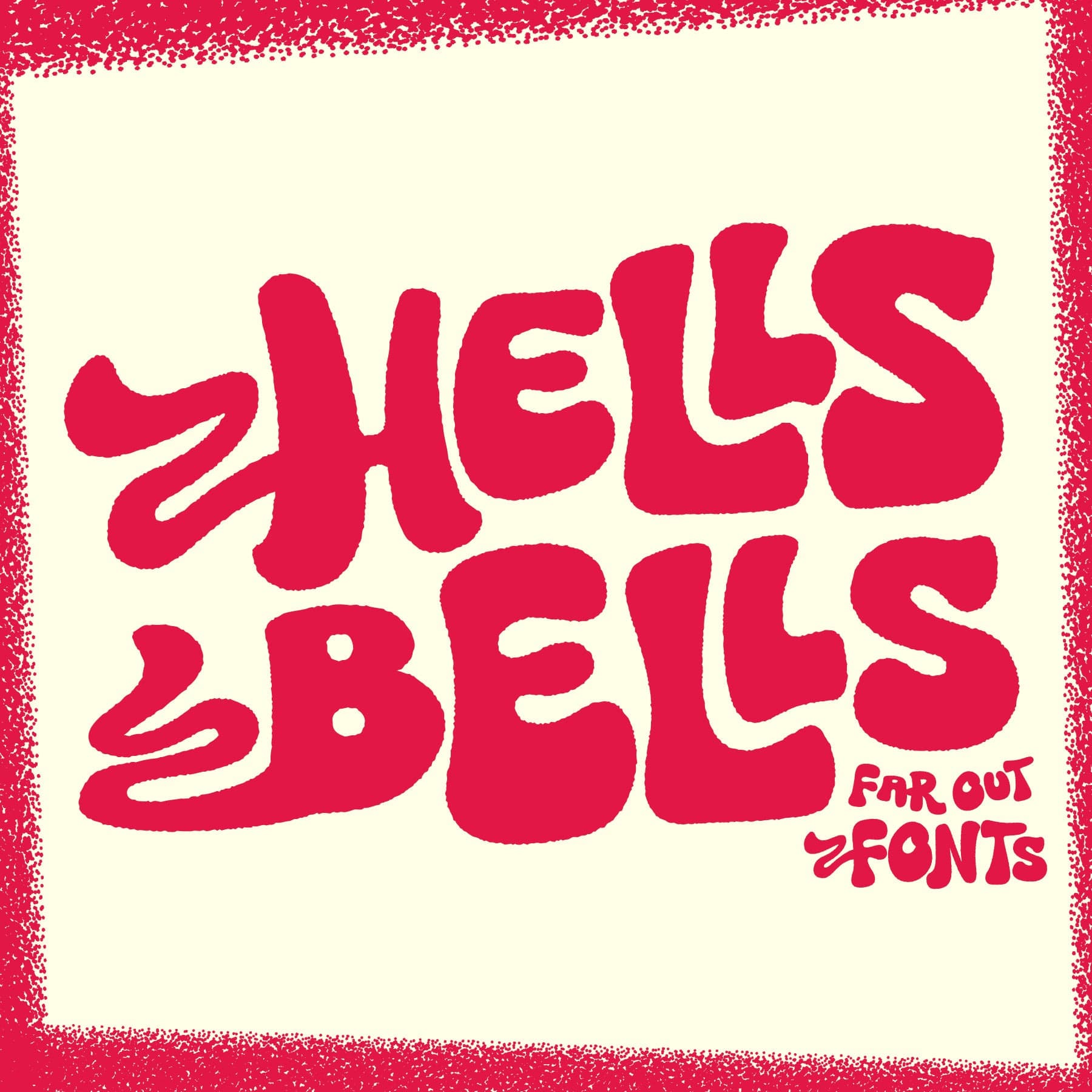
<p>A Decorative Bell Bottom Style Font Inspired by 1970s Poster Design</p> <p>The graphic design trends of the 1970s borrowed from the classical styles of Art Nouveau and Art Deco, adding a contemporary spin with its own psychedelic curves and strobing colours that spoke to an era of prog-rock, funk, and bell bottom flares. With Hells Bells, I've attempted to design a font that fits with this aesthetic, taking advantage of advanced OpenType features to create a lettering system of automatic interlocking type and decorative alternatives that would suit the most far-out of festival posters.</p> <p>While you're free to use Hells Bells like a standard font, it's only when you activate the OpenType features (sometimes referred to as Standard Ligatures or Stylistic Alternatives) that the type really comes alive. When you enter a combination of uppercase and lowercase characters (for example, R and o), you'll notice the letters automatically combine into interlocking versions that give this design its unique look. Add to this a complete alternative alphabet (so no repeating oo's and ee's) plus a further set with decorative flourishes, and it combines to create a versatile font with an authentically custom look. Search for the OpenType options in your software to experiment with the results; commonly available in most software that handles type such as Photoshop, Illustrator, and Word.</p> <p>Hells Bells is an all-caps design that offers a complete and unique set of uppercase and lowercase characters, along with numerals, punctuation, symbols, and language support. Two versions are provided; firstly, a clean, lightweight version for web and online applications, plus a textured version with an imperfect, ink-bleed-like edge for print-based projects. View the visuals for usage examples and enjoy!</p> <p>Contents:</p> <p>- Hells Bells Regular (Clean)<br>- Hells Bell Textured<br>- Formats: OTF, TTF and WOFF</p>